With the growing popularity of Smartphone market, the development of mobile technology has gradually been changing the interpersonal communication, from the past telephoning or SMS towards a more personalized, instant and interactive user scenario. Both the traditional PC application and innovative mobile one launch the mobile versions to the big market to fulfill various user requirements. However, different from the traditional PC interface or the larger size of tablets, many mobile application developers will make usability considerations and trade-offs on the arrangement of user interface and functionality in order to apply the interface design on a small handheld touch screen, but those indirectly have spawned a lot of usability problems.
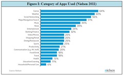
After Allion Labs, Inc.’s (Allion) first user experience research “Usability Test Report for Mobile Applications Part I”, this time we particularly focus on Smartphone with smaller touch interface as the test platform, and choose the same type (music and audio) mobile application as the test target to keep the test focus and make competitive analysis. The reason we select music and audio mobile application is that music search, playback or listen has become one of the major requirements for most Smartphone users; according to Nielsen’s report on Smartphone usage (Figure I), the category of music and audio mobile application is also one of the most popular applications on mobile platforms. With one test device and single type mobile application, we will observe the user behavior, context, satisfaction and comparison through the usability tasks. Through users’ real feelings and feedbacks, we not only provide the developers with the reference and reflection on human-computer interface design, but also look forward to better mobile applications with both functionality and usability into the market.
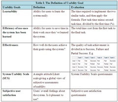
Based on the user’s profile, goal and task analytics, the main task and sub-tasks of application use cases are developed and types of usability goals are then accordingly determined and prioritized. The five types of usability goals are as follows (Table I):
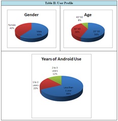
About the user base/profile (Table II), we recruit 25 different gender and age people to survey their years of Android use.
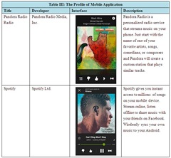
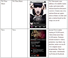
Like the previous usability test, we select four music and audio mobile applications (Table III) to implement usability test with camera recording. Before the test, we recruited two expert users and two amateur users to have interviews and pre-test to set up the “usability criteria” (Table IV). During the test, we use performance measurement, ex post facto measurement, questionnaire and interviewing to observe user’s learnability, efficiency, effectiveness, satisfaction, open evaluation and recommendations. Compared with the pre-test usability criteria (Table V), we analyze the test data to provide relevant root causes and solutions for mobile applications usability.
Usability Test Results
In Learnability, the averages of three mobile applications (Pandora Radio, We7 Free Music, Vevo) are higher than the criteria, which mean that the three ones are easy to learn and have ability for users to complete the following similar task easily. Conversely, the average of Spotify is lower than the criteria, which mean that it is not easily learned.
In Efficiency, the averages of four mobile applications are higher than the criteria, which mean that those usability tasks are not executed quickly.
In Effectiveness, only the average of We7 Free Music is higher than the criteria, which means that the tasks of We7 Free Music are completed with high quality. Conversely, the averages of other three mobile applications (Pandora Radio, Spotify, Vevo) are lower than the criteria, which mean that the tasks of three ones are not completed well.
Questionnaire Results
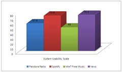
In System Usability Scale (SUS), four applications compared with each other can be found below:
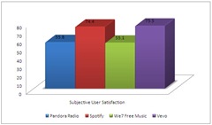
In Subjective User Satisfaction, four applications compared with each other can be found below:
The following is drafted to find issues and causes through the usability test and interview which can pose potential risks on four mobile applications, and then we provide follow-up disadvantages, recommendations and suggestions. We hope that any issues which could bring risks to mobile application can be addressed and resolved in the most early product stages.
In-depth Analysis & Suggestion
1. Pandora Radio
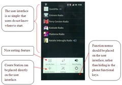
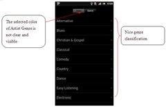
First, the function of Pandora Radio is relatively simple, but the design of its Home interface is too basic, monotonous and simplified for users so they have no idea how to begin operation. In addition, the design of hiding the function menus into phone functional keys completely obeys users’ habits, and most users would not expect to trigger menu with phone functional keys. Apparently, the design to hide many important functions such as searching and setting within phone functional keys, will cause users confused at their first sights. Based on our research, Pandora Radio’s Home interface still have much blank space available, we recommend that Pandora Radio should utilize the space to show the obvious and visible function menus, icons or operating guidelines to allow users aware of each function position easily. Second, in the task of searching, the icon colors of Artist and Genre are not explicitly labeled, the background colors of black and grey are too similar, the ambiguous style design could make users hard to tell different functions from each other.
We find that the Learnability of Pandora Radio is 54.39%, much higher than the usability criteria 37.65%, which means the Learnability is pretty high even if most users take much time to find the functions menus at first task. However, because the overall functionality of Pandora Radio is simple, users are able to get started quickly after several tasks. In Efficiency, the actual test costs 03’21’’ which is higher than the criteria 02’31’’; thus, we can find that users initially spend more time on looking for the function menus during the tasks. If users are not familiar with the location of phone functional keys, they will not be able to conduct a follow-up operation of the task. In other words, the function menus should be designed on the Home interface and placed in a prominent position to allow users quickly search the entire functional configuration. In Effectiveness, the criteria point 100%, and the actual test is 87%, the quality of task completed is generally worse because of the hidden function menus we mentioned above.
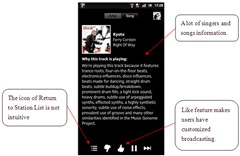
Actually, it is the right direction for Pandora Radio to focus on streaming broadcasting, providing a huge music library and information (we recommend the lyrics services added in the future), and allowing users to create their own customized stations. Additional Sorting and Like features, which are very practical and convenient, can make users have their own radio/music stations and be able to complete each task quickly within a few steps. However, the too simplified user interface should be rearranged on the function menus; This is not only to polish the overly monotonous interface, but the layout of classification and interface can also be further modified and integrated, so that the entire user interface can be properly used.
2. Spotify
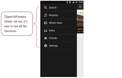
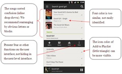
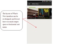
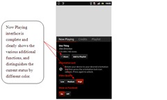
Basically, because the functions and icons of Spotify are labeled clear, users can easily understand the effect and purpose of each operation. Then, Spotify has considered different users’ habits; the function list is designed in different locations of the user interface, so users with different habits have the same intuitive feels while operating. For example, users are able to complete the tasks by long pressing or selecting the specific icon, the operation of Spotify is perfectly integrated. Unfortunately, the sort belongs to the drop-down menu after searching songs, and it puzzles users to look for songs. Besides, the font color of classification (Artist, Album and Tracks) is less clear, and the song and the singer’s font color is too shallow and difficult to identify. Last, the layout of “What’s New” belongs to the horizontal level which resulting with too many blank position retained below. We suggested Spotify can rearrange the user interface and music classification layout for users to hear music faster and easier than ever before.
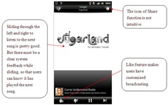
We find that the Learnability of Spotify is 20.31%, lower than the usability criteria 26.46%, which means that users pass through the first task, but do not complete the second similar task much quicker. According to our observation, the operation time between two tasks is not significant different; compared to other mobile application operations, the achievement rates of Spotify is relatively high actually. Therefore, we recommend that additional features icons and text color can help clear visibility, so that users can more quickly find its location and enhance Learnability. In Efficiency, the actual test costs 03’18’’ which is higher than the usability criteria 02’42’’, the interface operation is very fast; broadly speaking, users can complete the tasks quickly without any problems. However, we recommend that some functions such as Star and Share can be designed directly on the user interface, eliminating the time of looking for the next level interface. In Effectiveness, the criteria point is 100%, and the actual test is 98%. When users search songs, it is easy to overlook specific song as the font color contrast is not obvious. We recommend Spotify to use blocks or increase color contrast to distinguish, in order to allow users to clearly find the corresponding position of the singer, song and classification.
In sum, the music and audio function of Spotify is so powerful that users can complete the tasks with the user-friendly interface, and the following System Usability Scale and Subjective User Satisfaction are relatively high. After learning the first task, most users can quickly understand the meaning of each icon and the procedure of operation. It will make user interface become more friendly and perfect if Spotify could be revised for some minor issues we mentioned above.
3. We7 Free Music
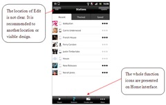
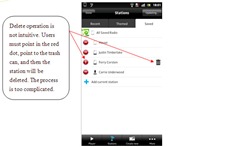
In fact, the Home interface design of We7 Free Music is fairly complete, and all options are properly placed on the user interface. Unfortunately, the design and arrangement of the icons do not comply with the user’s mental metaphor; for example, the Edit button is easy to be ignored due to the location. Also, the operation of deleting songs is very complicated, users need to press the particular red position, and then click the trash can to remove the songs. All above procedures are too redundant, so we recommend simplifying it with one-step operation.
We find that the Learnability of We7 Free Music is 32.52%, higher than the usability criteria 28.15%. In addition to spend some time on looking for the Share function which icon is not clear and visible, users can complete the second tasks much quicker. In Efficiency, the actual test costs 3’53’’ which is higher than the usability criteria 3’05’’. Both the time between interface operation and task achievement are higher than the usability criteria. Particularly, when users want to delete saved songs, it is easy to overlook the Edit icon in the top left corner; that is, they need to spend some time on browsing all around, and then find the icon. Besides, the steps of deleting songs are not intuitive and too complicated to affect the task completion time. In Effectiveness, the usability criteria point 96.88%, and the actual test is 97.5%. Due to the functions and icons on Home interface are generally presented, users mostly can operate it well by existing interface information. If the position of those icons can be redesigned to be visible and clear, the quality of the task achievement will improve more.
To sum up, we find that each function of We7 Free Music is presented on Home interface so that users can easily browse to look for all functionality. However, the icon design is not intuitive, so users must spend some time in order to understand its significance; in addition, the location of the function or icon is not obvious and visible. Therefore, we recommend some operational steps can be simplified; for example, users can make related settings or delete the songs by long press the icon, and need not to complete the task through layer by layer interface which causes users confused.
4. Vevo
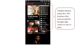
Compared with other three mobile applications, users are willing to continue to use Vevo, and have better feedbacks on System Usability Scale and Subjective User Satisfaction. In addition to functional need, we also find that the user interface of Vevo is simple and clear, the icon and position are also visible. Even if there will be strangeness in initial use; after first learning task, the second task performance is much faster than before. We especially recommend that each function has a different mode of operation, so that the different habits of users can easily get started. That is, Vevo’s user interface design is very consistent with users’ visibility, icon correspondence, cognitive consistency and potential default usability.
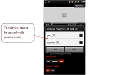
We find that the Learnability of Vevo is 48.66%, much higher than the usability criteria 29.8%; that is, users can easily complete the second task after the first one. In Efficiency, the actual test costs 03’18’’ which is higher than the usability criteria 02’12’’. The longer result than usability criteria may be due to some function icons are still not visible, like the font size is kind of small. We suggest the fonts or icons can be designed with differential color, so that users can complete tasks more quickly. In Effectiveness, the criteria point 100%, and the actual test is 98.5%. In actual test, most users can complete the tasks, and the only drawback is that the playlist must be defined in advance and could not be created in the process of playing music.
Generally speaking, Vevo provides a complete and high-quality audio and video database, and the function menus are clearly presented on user interface. Besides, additional pictures and text description let users quickly search for their desired music information. The function menu also corresponds with the phone functional keys to meet the different users’ habits. Regrettably, the pull-down menu presents too much music information and pictures on Home interface, which affects users’ visual search process, and the design that users must continue the drop-down to browse the entire music information is slightly complicated. We suggest here can be more advanced by using classification and sorting. Compared with other mobile applications, Vevo can almost fulfill users’ requirements of entertainment and information. Simple user interface design with clear icons; even if one single function, Vevo is still able to attach other Share or Search function to allow users to obtain satisfaction of usability and continue to use it with loyalty.
In view of our consumer electronics products, from traditional PCs to laptops, tablets and mobile phones with much smaller user interface but higher portability and mobility, affecting the user’s operating scenario and life context become more diversified. The value of mobile application not only helps users solve their life problems with technology and functionality, but it also provides easy-to-use usability based on various user requirements. Through personal observation and experiencing a variety of users’ lifestyle, mobile application developers can create the best products that meet all users’ needs. No matter any problems on communication, entertainment or professional skills, all users’ requirements are not just a tool, but life’s problems could be solved by a powerful and user-friendly mobile application.
Therefore, due to the mobile application in our daily lives has gradually played an essential role; based on the user-centered view, we try to discuss the process of Human-Computer Interaction from actual interviews, tests and records for the known good mobile applications. Not only focused on the functional issues, we especially pay attention to users’ real feedbacks and feelings. Through the usability test to explore the root causes of user experience and user interface, we provide some assessments and recommendations for improvement. In this test report, we select four music and audio mobile applications to implement the complete usability test and find a lot of HCI or usability issues between users and mobile applications. In sum, Allion proposes a concept and imagination for any mobile application to be more well-functional and well-usable; in the future, we not only can validate its functionality such as network connectivity and local close beta test, but we can also propose the usability test, evaluation and competitive analysis which are closely related to the real users.


