I. Background
According to the well-known research institutions, Flurry, which compared its mobile data to stats from comScore and Alexa, found that consumers spent 81 minutes per day using mobile applications, compared to 74 minutes of web surfing. Flurry found consumers spend 9% more time, on average, using mobile applications than the web; that is, the shift comes as combined tablet and smart phone shipments eclipsed those of desktops and notebooks for the first time.
Since Apple launched iPhone, the breakthrough, value-added service and innovative function of mobile applications have directly changed the business model of the overall mobile market. So far, according to data released by Apple, the global downloads in its App store has more than 25 billion times, and continued rapid growth. Besides, Gartner also found that the output value of global mobile applications in 2010 is $ 5.2 billion, and to more than $ 15.1 billion in 2011. The technological behavior and ecosystem shifts are not only due to the innovation of front-end technology, software or hardware, but also are improved by tens of thousands of application developers which have been put into the research and design of application. Based on IDC’s forecast, the future development of mobile applications will be integrated with cloud computing, mobile technology, social network business and big data analytics to produce a great deal of market size and commercial value.
Although the success of mobile applications enhances many international enterprises’ profitability and attracts more mobile applications developers to invest heavily in the business; for a long-term plan, the development of mobile applications should pay more attentions to the user’s behavior, scenario, feeling and feedback when he or she uses them. In other words, no matter the mobile applications need to be paid or not, to have creative function or not, user cares about the application functions and performances, and especially focuses on the usability (the process of Human-Computer Interaction, HCI) of mobile application. In fact, Human-Computer Interaction studies have not been the popular topic at all, almost all the hardware and software interfaces are gradually adopted the design concept, User-Centered Design (UCD).
User-Centered design is a design philosophy and a process in which the needs, wants, and limitations of end users of an application are given extensive attention at each stage of the design process. User-centered design can not only require designers to analyze and foresee how users are likely to use a product, but also to test the validity of their assumptions with regards to user behavior in real world. Therefore, in the era of mobile applications, how to integrate the function and user interface to optimize the application around how users can, want or need to use it has become the most essential thing in potential business model, rather than forcing the users to change their behavior to accommodate the mobile applications.
II. Purpose
In response to the trend of mobile applications, we specifically target several categories of mobile applications which are closely related to user’s life, including music & audio, photography, transportation and productivity. Through the in-depth interview and usability test to realize the design of application interface could provide user with functional satisfaction of information and entertainment. What we focus on is that the application interface is easy to use, easy to learn or attractive enough to user. During the process of using mobile applications, we will concluded the potential risks and the possible causes for usability, and then propose the interface re-design possibilities and recommendations. Based on the above background and purpose; in conclusion, we target four mobile applications which have high market share to define the goals of usability testing, and then to implement usability test and questionnaires. Defining the goals of the user evaluation is perhaps the most important step of this entire process. The goal consists of two parts – User’s goals and the Usability goals.
A. User’s goals:
The goals users wish to achieve; for example, interacting with the mobile applications interface and function well to complete the tasks.
B. Usability goals (User Performance Evaluation Goals):
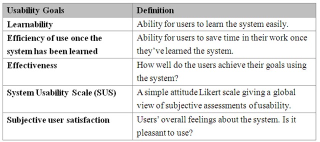
Based on the user’s profile, goal and task analytics, the main task and sub-tasks of using the selected applications are developed and types of usability goals are then accordingly determined and prioritized. The five types of usability goals are as follows:
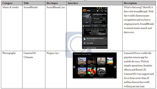
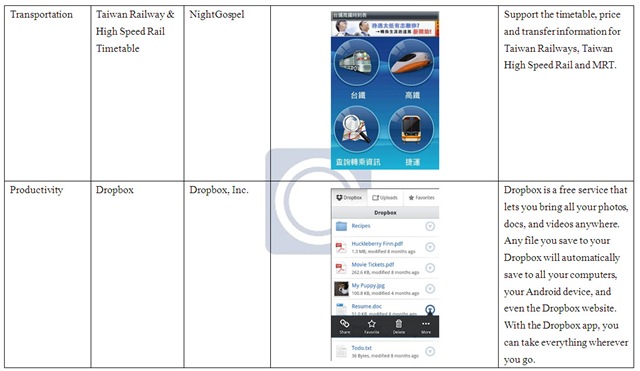
III. Target mobile applications
IV. Method
In order to achieve the purpose, we select four mobile applications to implement usability test with camera recording. Before the test, we recruited two expert users and two amateur users to have interviews and pre-test to gain the “usability criteria”. During the test, we use performance measurement, ex post facto measurement, questionnaire and interviewing to observe user’s learnability, efficiency, effectiveness, satisfaction, open evaluation and recommendations. Compared with the pre-test usability criteria, we analyze the test data to provide relevant root causes and solutions for mobile applications usability.
V. Usability Criteria
A. Criteria are based on…
Based on user profile, usability goals and test tasks, we set three criteria, including learnability, efficiency and effectiveness, and two questionnaires such as System Usability Scale and Satisfaction Scale.
1. Learnability
By the time cost to repeat the same task, and then apply the formula calculation.
2. Efficiency
Based on the total time to complete the whole tasks, and then assess the efficiency.
3. Effectiveness
According to the task performance to define success, partial success or fail, and then apply the formula calculation.
B. Criteria sources
We recruited two expert users and two amateur users to implement usability pre-test of four mobile applications. The results are as follows:
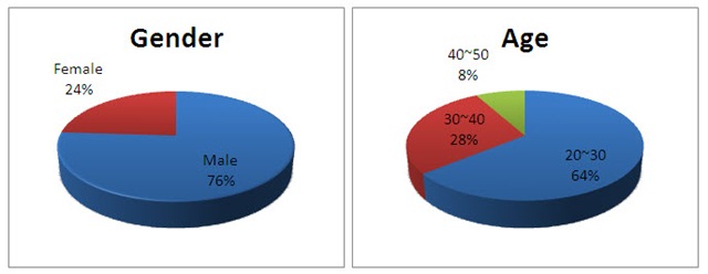
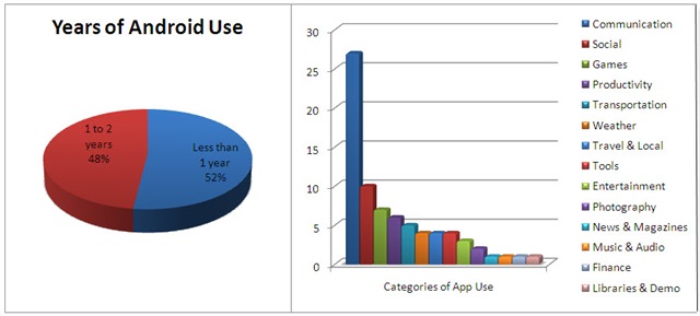
VI. Subjects
VII. Results
A. Usability Test Data
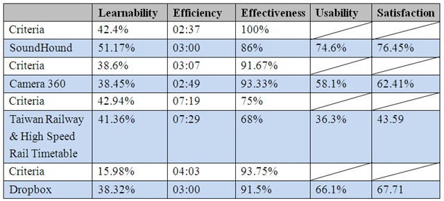
The average usability data of 25 subjects are as follows:
B. Questionnaire Results
In System Usability Scale (SUS), four applications compared with each other can be found:
SoundHound>Dropbox>Camera 360>Taiwan Railway & High Speed Rail Timetable
In Satisfaction, four applications compared with each other can be found:
SoundHound>Dropbox>Camera 360>Taiwan Railway & High Speed Rail Timetable
C. Usability Test Results
In Learnability, the averages of two mobile applications (SoundHound and Dropbox) are higher than the criteria, which mean that the two ones are easy to learn. Conversely, the averages of other two mobile applications (Camera 360 and Taiwan Railway & High Speed Rail Timetable) are lower than the criteria, which mean that they are not learned easily.
In Efficiency, the averages of two mobile applications (Camera 360 and Dropbox) are lower than the criteria, which mean that the two ones are quick to be executed. Conversely, the averages of other two mobile applications (SoundHound and Taiwan Railway & High Speed Rail Timetable) are higher than the criteria, which mean that they are not executed quickly.
In Effectiveness, only the average of Camera 360 is higher than the criteria, which mean that the tasks of Camera 360 are completed with high quality. Conversely, the averages of other three mobile applications (SoundHound, Taiwan Railway & High Speed Rail Timetable and Dropbox) are lower than the criteria, which mean that the tasks of three ones are not completed well.
D. Discussion
The following is drafted to find issues and causes through the usability test and interview which can pose potential risks on four mobile applications, and then we provide follow-up disadvantages, recommendations and suggestions. We hope that any issues which could bring risks to mobile application can be addressed and resolved in the most early product stages.
1. SoundHound
Compared with other four mobile applications, users are willing to continue to use SoundHound, and have better feedbacks on usability and satisfaction scales. In addition to functional need, we also find that the user interface of SoundHound is simple and clear, the icon and position are also visible. Even if there will be strangeness in initial use; after one learning task, the second task performance is much faster than before.
We find that the Learnability of SoundHound is 51.17%, higher than the usability criteria 42.4%. In Efficiency, the actual test costs 3:00 which is higher than the usability criteria 2:37, the reason we predict here is that some function icons, such as Play and Lyrics, are still not obvious to attract users’ attention. Future recommendations are that the function icon could be designed more visible and added some tips, so that users can complete the tasks faster. In Effectiveness, the usability criteria point 100%, and the actual test is 86%. In pretest, there are half the experts and amateurs; but in the actual test, most of the users are amateurs who will affect the whole quality of task completing. Also, many users often ignored the task instruction of Play music which result in the lack of effectiveness.
Generally speaking, the music recognition of SounHound is very powerful, so that it can fulfill users’ requirements of entertainment and information. Simple user interface design with clear icons; even if one single function, SounHound is still able to attach other share or lyrics function to allow users obtain satisfaction of usability and continue to use it with loyalty.
2. Camera 360
First, the user interface of Camera 360 should provide some interface guidelines, such as Assistant or obvious Instruction Text. And most users are confused with the right icons which are not visible and intuitive to understand the representatives on Home interface in particular. We recommend Camera 360 to design more metaphor icons with users’ minds in order to increase the learnability, visibility, and allow users identify as well as use easily. Then, the disadvantage of functions, such as the auto-rotate screen is messy, the rotated interface causes inconvenience to users; in actual test process, we constantly observe users turn the Tablet PC round and round.
We find that the Learnability of Camera 360 is 38.45%, lower than the usability criteria 38.6%. That is, after the first task, users do not get a good sense of the user interface, and it takes time to complete the second task. Due to the icons are not visible and intuitive, users think that they should covert the photo effect in Album rather than after taking pictures. We recommend that the photo can be converted after shooting or in Album; as a result, it can meet users’ habits. In Efficiency, the actual test costs 2:49 which is lower than the criteria 3:07; thus, we can find the interface operation and task completed are fairly quick. However, the icon which represents the Home-Back is not clear, so many users spend much time on coming back to Home. In Effectiveness, the criteria point 91.67%, and the actual test is 93.33%, the quality of task completed is generally good because the camera application is relatively simple.
In fact, the special photo effects function of Camera 360 can almost fulfill entertainment needs and satisfaction of users. However, the classification and user interface layout need to be further modified and integrated to allow users operate more intuitive. Besides, the user group and market of photography application are rather extensive, so one good-use application needs its icon designed more intuitive and user friendly to make users easily get started without going through repeated learning.
3. Taiwan Railway & High Speed Rail Timetable
Compared with other four applications, the usability test and satisfaction of Taiwan Railway & High Speed Rail Timetable is worst; in addition to the clear icons of Taiwan Railway, High Speed Rail and interchange information on Home interface, the rest of operation and user interfaces make users confused. Through the actual test, we find that the representation of interchange information is not too explicit for users to spend more time on reading the information list, even misled by other functions. Take task 1 for example, users take some times to read results when they want to search the interchange from High Speed Rail to Taiwan Railway. Also, partial titles of the icons let users misunderstand its function; for example, users will continue to search the time of the Taiwan Railway while looking for the reservation system, and then they can’t complete the booking task.
We find that the Learnability of Taiwan Railway & High Speed Rail Timetable is 41.36%, lower than the usability criteria 42.94%, which mean that its learnability is too low to make users spend much time on reading interchange information. And the information list is so complex, that users can not make sense of what it represents and where to take interchange. Actually, the design concept of interchange information is good, but it ignores the overall information representation. We recommend that Taiwan Railway & High Speed Rail Timetable can rearrange the information list with color and block to mark the stations, starting and ending time, not just list the tabular information. In Efficiency, the actual test costs 7:29 which is higher than the usability criteria 7:19 and other mobile applications’ Efficiency. Almost 90% of users abandon the task while searching the reservation system due to the design position of the system is hidden in the Tablet PC Menu, rather than presented on the user interface. It is a fatal design that users will constantly search for the frequency on Taiwan Railway interface, rather than giving much thought to the Tablet PC Menu. Therefore, the design here is greatly misleading users, not only do not intuitive, but also make users waste a lot of time on searching and browsing. In Effectiveness, the usability criteria point 75%, and the actual test is 68%. Because of the interchange information and reservation system, the whole qualities of task completed are not good, and the messy auto-rotated screen also affects users’ visions inconveniently.
In conclusion, we think that the Home interface of Taiwan Railway & High Speed Rail Timetable is very clear and visible, directly showing the icons of the High Speed Rail, Taiwan Railway as well as MRT, so that users can intuitively select the traffic information they want to query. Unfortunately, there are still many details such as windows, pages, tables and so on, have to be adjusted and improved. On the other hand, Taiwan Railway & High Speed Rail Timetable actually has a lot of traffic information, but the host server is often unstable, resulting in functional performance is not smooth; besides, there are many small bugs such as text errors and crashes need to be corrected sustainably.
4. Dropbox
Basically, because the function and operation of Dropbox are simple and clear, users can easily understand the effect and purpose of each function. In addition, Dropbox has considered different users’ habits; the function list is designed in different locations of the user interface, so that users with different habits have the same intuitive feels while operating. Particularly, we recommend that each function has its intuitive icon, and some potential functions can get exposed to meet users’ visibility, icon correspondence, cognitive consistency and potential default usability.
We find that the Learnability of Dropbox is 38.32%, much higher than the usability criteria 15.98%; that is, users can easily complete the second task after the first one. The only drawback of Dropbox is that the Upload icon is designed too low for users to ignore its location easily. Besides, the movement between folder and folder is unlike the general route on PC, so many users are confused with the Next and Previous icons on the use interface. In Efficiency, the actual test costs 3:00 which is lower than the usability criteria 4:03, the interface operation is very fast; broadly speaking, users can complete the tasks quickly without any problems. In Effectiveness, the criteria point 93.75%, and the actual test is 91.5%. When users upload the photo, it is easy to overlook the specific folder which can be selected because the icon here is small and unobvious. Thus, we propose that the icon of upload function have to be designed more visible, using the font size or color to distinguish, in order to allow users to clearly see the corresponding location of each function.
In sum, because the function of Dropbox is simple and clear, most users can complete the tasks successfully according to the user interface, and feel satisfied with its usability. After the first task, they can also realize the meaning and operation of each icon quickly. The user interface will become more friendly and perfect if Dropbox can be revised for some minor issues we mentioned above.
VIII. Conclusion
With the popularity of mobile devices and applications, the applications have become more and more important in the world. Through a wide range of mobile applications, users can not only purchase them and share the audio-visual files, but also search or exchange the related information or knowledge. As a result, how to design the mobile application interface to fulfill users’ needs has become the most important thing in the field of contemporary mobile application design and development.
Due to the mobile application in our daily lives has gradually played an essential role; based on the user-centered view, we try to discuss the process of Human-Computer Interaction from actual interviews, tests and records. Not only focused on the functional issues, we especially pay attention to users’ real feedbacks and feelings. Through the testing process to explore the root causes on usability and user interface, we provide some assessments and recommendations for improvement. It is noteworthy that; in the considerations of cost and time, regardless of the mobile application designer or developer usually tends to focus on the functional performance and ignore the basic HCI process while designing an mobile application. It has resulted in the product design does not fit into the users’ true feelings, needs and feedbacks; unfortunately, we have still seen many well-intended and innovative mobile applications failed in the market because of the lack of well usability. To avoid the issues, we particularly make the usability test and report for mobile applications. The purpose is not only providing the issue debugged for functionality, but also contacts with the real users to realize their feedbacks and usability issues according to their actual operational behaviors. Based on the test, we can explore some usability issues which are ignored easily by mobile application designer or developer.
Usability is the ease of use and learnability (easy to learn) object which is especially focused on the effect of user interface to usability and in accordance with the usability criteria and questionnaire results to have assessments and recommendations for improvement. In this test report, we select four mobile applications to implement the complete usability tests; according to the interview, user profiles, task-designed, usability criteria and subjects recruited, we find a lot of HCI or usability issues between users and mobile applications. Understanding these issues can be more in-depth users’ usability patterns and habits which are easily ignored by the application designer or developer, and then put forward recommendations on the improvement and upgrade. For any application to be more well-functional and well-usable; in the future, we not only can validate its functionality such as network connectivity and local close beta test, but we can also propose the usability test, evaluation and competitive analysis which are closely related to the real users.


